


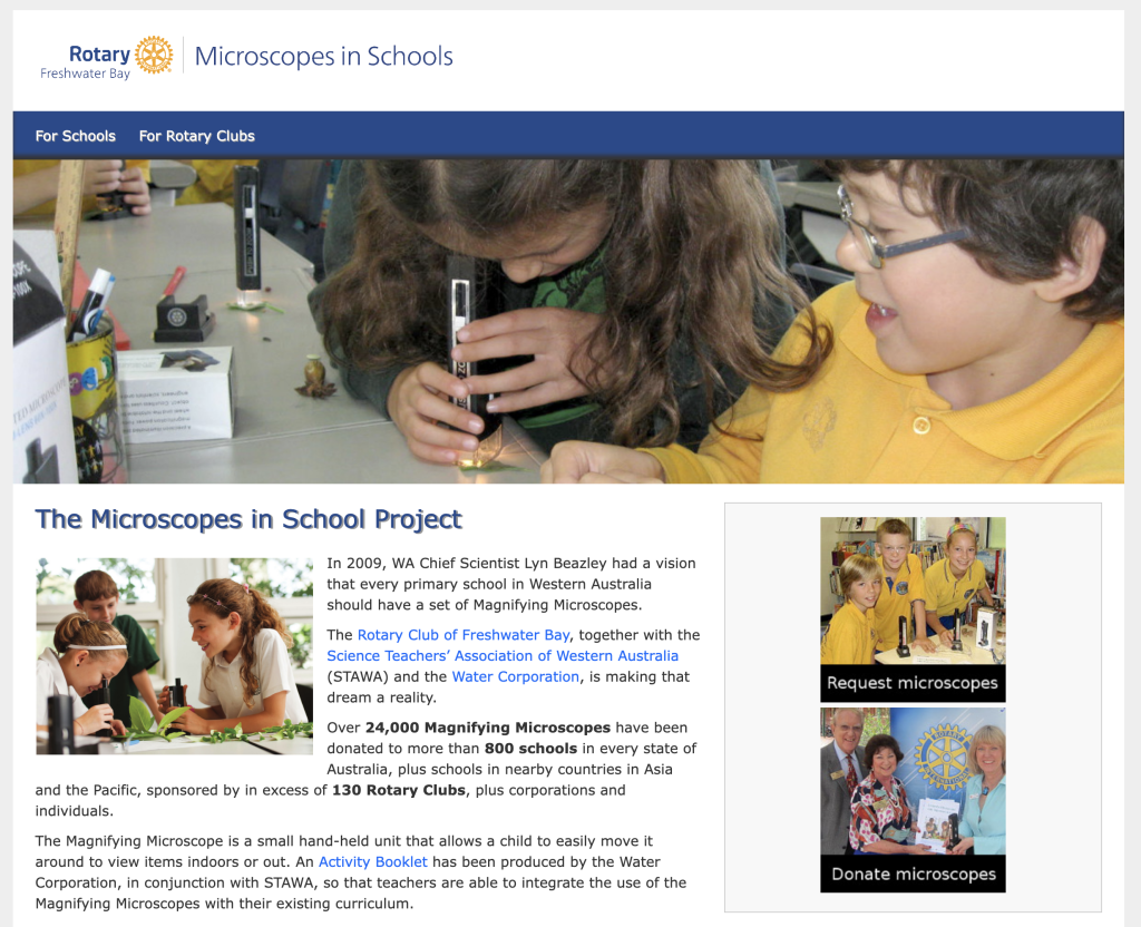
In updating the Microscopes in Schools website this week, it struck me that this tiny site has stood the test of time, fulfilling its function with minimal cost and minimal time investment required.
This site has remained largely unchanged since 2012 (the earliest snapshot the Wayback Machine has is from March 2015), though with Rotary rebranding since the site was launched it has had the new logo applied, and a slight change of colour as a result. Other than that, I periodically update the statistics of how many microscopes have been donated, and check and fix the links to external sites.
I have made some minor custom CSS additions to give the theme used a slightly more professional look. It’s amazing the difference a little text-shadow on titles / headings can make, and a little box-shadow on the navigation bar to make it look 3D.
I know that the average person tends to be awed by graphics-heavy web sites, but quite often the design gets in the way of the useful function of the site: finding what one needs. I prefer to focus on the usability first and foremost, and then dress the site up to look prettier.
- Clean.
- Simple.
- Functional.
- Accessible.
- Easy to read.
- Easy to use.
And very importantly, this site ranks very highly in search engines, which has helped make this project a roaring success. This website definitely shows that keeping it simple, yet professional, is definitely the way to go!